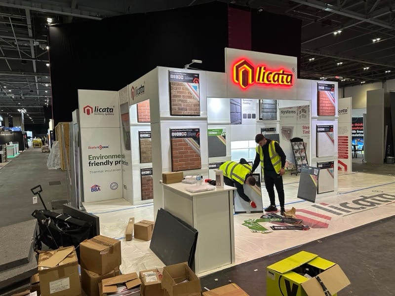
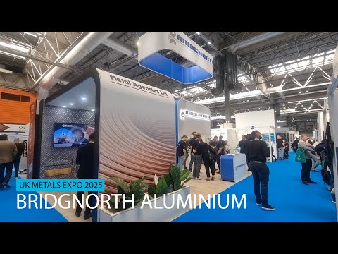
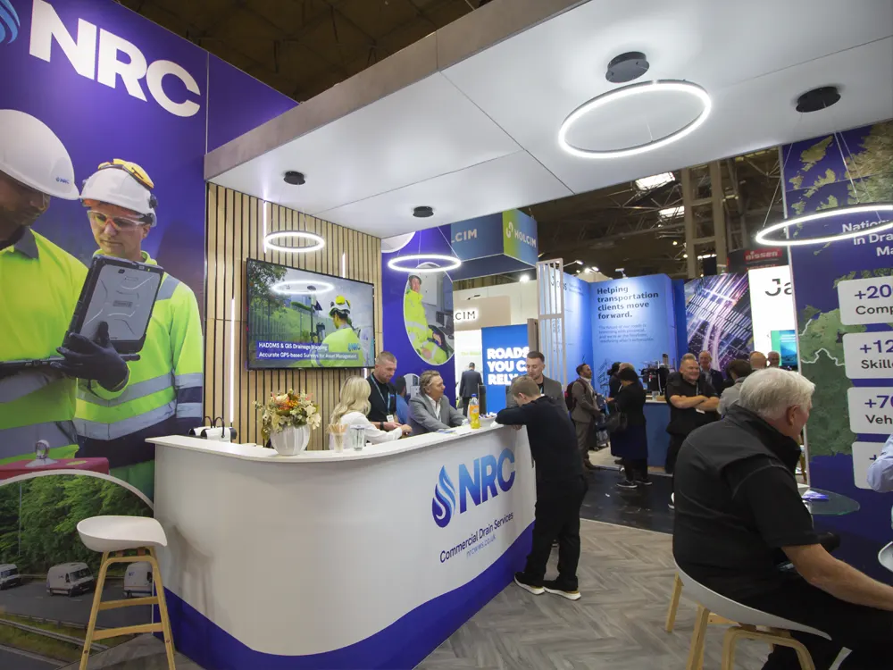
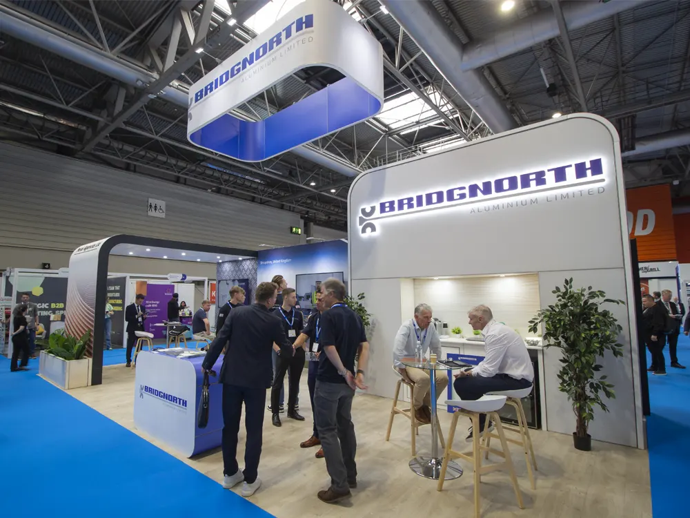
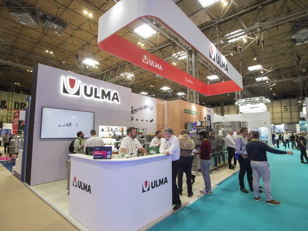
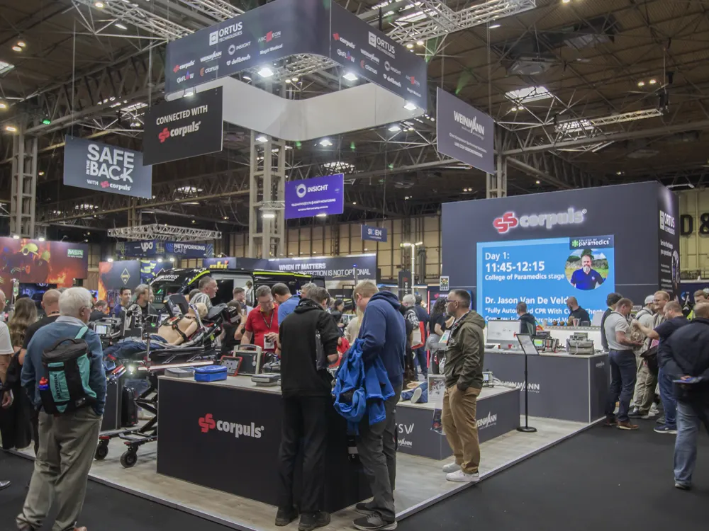
A few weeks ago our exhibition stand company had to do some very long hours to get Sage’s new exhibition stand turned around in less than a week! Nicole from Sage kindly got in touch afterwards to tell us how great the stand was. However, the real point of this email is to show you just how realistic graphics can look on stands and why the move away from traditional custom builds to modular could be the best move you make for your bank balance and budget.
Here is the feedback we received back from Sage.
“I have attached some images I took at the show last week. The stand was fantastic! Those who came over to it to have a conversation with us loved it, but also those just walking by made a point of saying how great they thought it looked. People were feeling the ‘stone-look’ wall to see how it was constructed because it looked so realistic. I had comments on both Twitter and LinkedIn about how great it looked. The Sage logo hanging overhead from the ceiling too, was the first thing you could see as you entered the exhibition and made it extremely easy to find”
We were all really pleased with the stand and I just wanted to share with you their feedback and see if there was anything we could help you out with?
If you have an upcoming exhibition contact us to get a free exhibition stand design
If you want any advice on your next exhibition just give us a call on 01782 264110
Go Social
Share this post with your friends!

